239

I've written an XML text editor that provides 2 view options for the same XML text, one indented (virtually), the other left-justified. The motivation for the left-justified view is to help users 'see' the whitespace characters they're using for indentation of plain-text or XPath code without interference from indentation that is an automated side-effect of the XML context.

I want to provide visual clues (in the non-editable part of the editor) for the left-justified mode that will help the user, but without getting too elaborate.

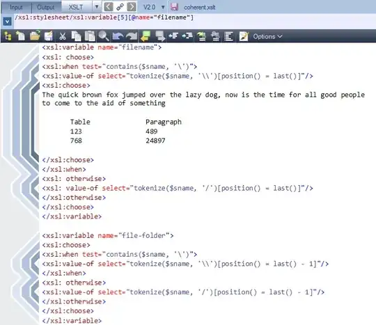
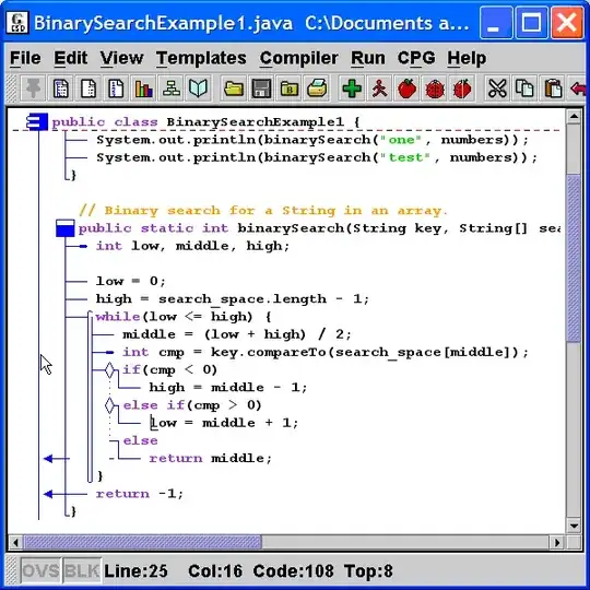
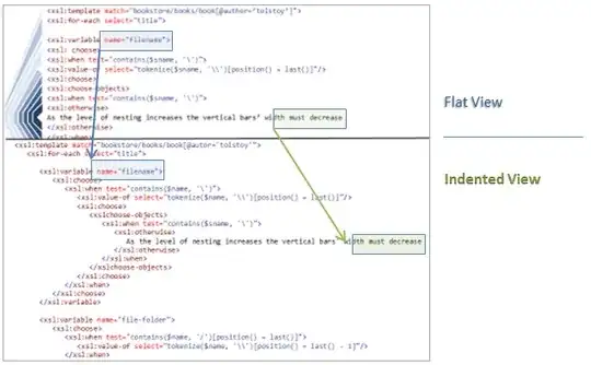
I tried just using connecting lines, but that seemed too busy. The best I've come up with so far is shown in a mocked up screenshot of the editor below, but I'm seeking better/simpler alternatives (that don't require too much code).

code editor nesting level indication

[Edit]

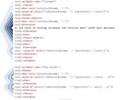
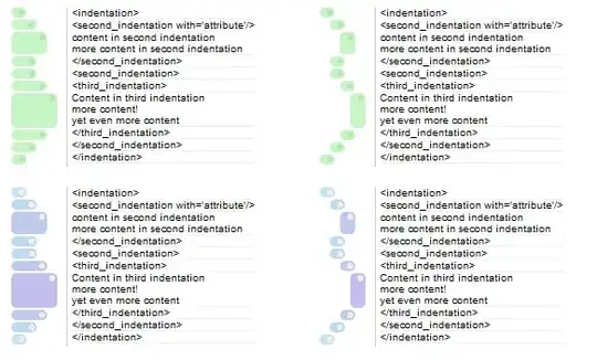
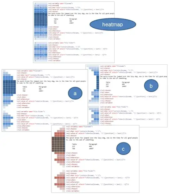
Taking the heatmap idea (from: @jimp) I get this and 3 alternatives - labelled a, b and c:

Initial ideas

The following section describes the accepted answer as a proposal, bringing together ideas from a number of other answers and comments. As this question is now community wiki, please feel free to update this.


NestView

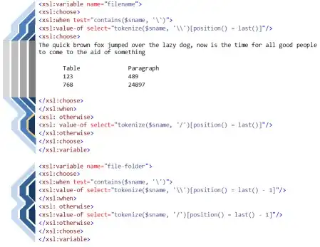
The name for this idea which provides a visual method to improve the readability of nested code without using indentation.

Contour Lines

The name for the differently shaded lines within the NestView

enter image description here

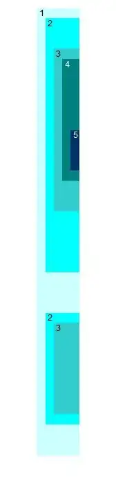
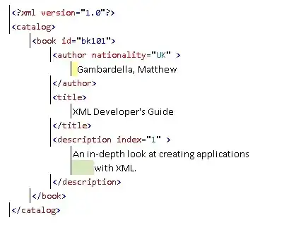
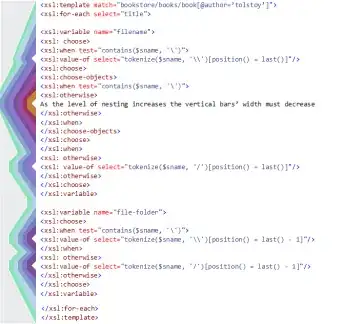
The image above shows the NestView used to help visualise an XML snippet. Though XML is used for this illustration, any other code syntax that uses nesting could have been used for this illustration.

An Overview:

  1. The contour lines are shaded (as in a heatmap) to convey nesting level

  2. The contour lines are angled to show when a nesting level is being either opened or closed.

  3. A contour line links the start of a nesting level to the corresponding end.

  4. The combined width of contour lines give a visual impression of nesting level, in addition to the heatmap.

  5. The width of the NestView may be manually resizable, but should not change as the code changes. Contour lines can either be compressed or truncated to keep acheive this.

  6. Blank lines are sometimes used code to break up text into more digestable chunks. Such lines could trigger special behaviour in the NestView. For example the heatmap could be reset or a background color contour line used, or both.

  7. One or more contour lines associated with the currently selected code can be highlighted. The contour line associated with the selected code level would be emphasized the most, but other contour lines could also 'light up' in addition to help highlight the containing nested group

  8. Different behaviors (such as code folding or code selection) can be associated with clicking/double-clicking on a Contour Line.

  9. Different parts of a contour line (leading, middle or trailing edge) may have different dynamic behaviors associated.

  10. Tooltips can be shown on a mouse hover event over a contour line

  11. The NestView is updated continously as the code is edited. Where nesting is not well-balanced assumptions can be made where the nesting level should end, but the associated temporary contour lines must be highlighted in some way as a warning.

  12. Drag and drop behaviors of Contour Lines can be supported. Behaviour may vary according to the part of the contour line being dragged.

  13. Features commonly found in the left margin such as line numbering and colour highlighting for errors and change state could overlay the NestView.

Additional Functionality

The proposal addresses a range of additional issues - many are outside the scope of the original question, but a useful side-effect.

Visually linking the start and end of a nested region

The contour lines connect the start and end of each nested level

Highlighting the context of the currently selected line

As code is selected, the associated nest-level in the NestView can be highlighted

Differentiating between code regions at the same nesting level

In the case of XML different hues could be used for different namespaces. Programming languages (such as c#) support named regions that could be used in a similar way.

Dividing areas within a nesting area into different visual blocks

Extra lines are often inserted into code to aid readability. Such empty lines could be used to reset the saturation level of the NestView's contour lines.

Multi-Column Code View

Code without indentation makes the use of a multi-column view more effective because word-wrap or horizontal scrolling is less likely to be required. In this view, once code has reach the bottom of one column, it flows into the next one:

enter image description here

Usage beyond merely providing a visual aid

As proposed in the overview, the NestView could provide a range of editing and selection features which would be broadly in line with what is expected from a TreeView control. The key difference is that a typical TreeView node has 2 parts: an expander and the node icon. A NestView contour line can have as many as 3 parts: an opener (sloping), a connector (vertical) and a close (sloping).


On Indentation

The NestView presented alongside non-indented code complements, but is unlikely to replace, the conventional indented code view.

It's likely that any solutions adopting a NestView, will provide a method to switch seamlessly between indented and non-indented code views without affecting any of the code text itself - including whitespace characters. One technique for the indented view would be 'Virtual Formatting' - where a dynamic left-margin is used in lieu of tab or space characters. The same nesting-level data used to dynamically render the NestView could also used for the more conventional-looking indented view.

Printing

Indentation will be important for the readability of printed code. Here, the absence of tab/space characters and a dynamic left-margin means that the text can wrap at the right-margin and still maintain the integrity of the indented view. Line numbers can be used as visual markers that indicate where code is word-wrapped and also the exact position of indentation:

enter image description here

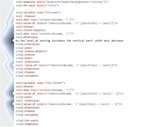
Screen Real-Estate: Flat Vs Indented

Addressing the question of whether the NestView uses up valuable screen real-estate:

Contour lines work well with a width the same as the code editor's character width. A NestView width of 12 character widths can therefore accommodate 12 levels of nesting before contour lines are truncated/compressed.

If an indented view uses 3 character-widths for each nesting level then space is saved until nesting reaches 4 levels of nesting, after this nesting level the flat view has a space-saving advantage that increases with each nesting level.

Note: A minimum indentation of 4 character widths is often recommended for code, however XML often manages with less. Also, Virtual Formatting permits less indentation to be used because there's no risk of alignment issues

A comparison of the 2 views is shown below:

enter image description here

Based on the above, its probably fair to conclude that view style choice will be based on factors other than screen real-estate. The one exception is where screen space is at a premium, for example on a Netbook/Tablet or when multiple code windows are open. In these cases, the resizable NestView would seem to be a clear winner.

Use Cases

Examples of real-world examples where NestView may be a useful option:

  1. Where screen real-estate is at a premium

    a. On devices such as tablets, notepads and smartphones

    b. When showing code on websites

    c. When multiple code windows need to be visible on the desktop simultaneously

  2. Where consistent whitespace indentation of text within code is a priority

  3. For reviewing deeply nested code. For example where sub-languages (e.g. Linq in C# or XPath in XSLT) might cause high levels of nesting.

Accessibility

Resizing and color options must be provided to aid those with visual impairments, and also to suit environmental conditions and personal preferences:

enter image description here

Compatability of edited code with other systems

A solution incorporating a NestView option should ideally be capable of stripping leading tab and space characters (identified as only having a formatting role) from imported code. Then, once stripped, the code could be rendered neatly in both the left-justified and indented views without change. For many users relying on systems such as merging and diff tools that are not whitespace-aware this will be a major concern (if not a complete show-stopper).


Other Works:

Visualisation of Overlapping Markup

Published research by Wendell Piez, dated from 2004, addresses the issue of the visualisation of overlapping markup, specifically LMNL. This includes SVG graphics with significant similarities to the NestView proposal, as such, they are acknowledged here.

The visual differences are clear in the images (below), the key functional distinction is that NestView is intended only for well-nested XML or code, whereas Wendell Piez's graphics are designed to represent overlapped nesting.

enter image description here

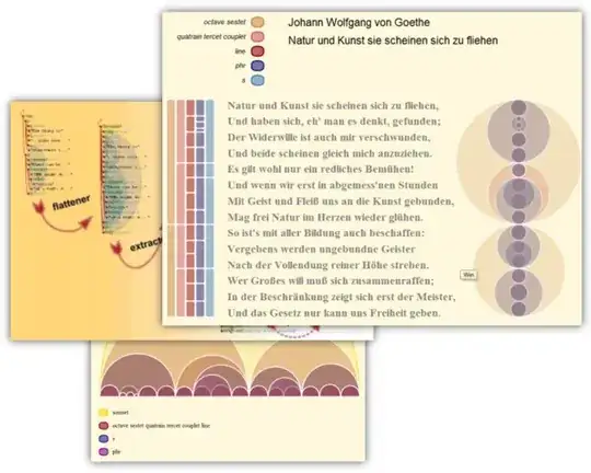
The graphics above were reproduced - with kind permission - from http://www.piez.org

Sources:

  1. Towards Hermenutic Markup
  2. Half-steps toward LMNL
pgfearo
  • 944
  • 4
  • 11
  • 19
  • 7
    I have no real answer for you, just opinion. Looking at your examples, B is my preferred choice. It stands out for me because the "heatmap" actually follows the indenting instead of mirroring it like the first example and C do. A also follows the actual indenting, but B is more like what you would see when the actual xml would be indented. The second example is simply too "solid" for my liking. – Marjan Venema Jun 26 '11 at 08:04
  • 4
    I would prefer indented code myself. Not sure what the benefit of this would be? Am I missing something obvious? (Really do not intend for this to sound negative.) – Chris Jun 28 '11 at 16:36
  • @Chris. You're not alone, so I've invested more effort in providing a (virtually) indented view option. The flat view is most useful when there's a lot of whitespace text formatting that you need to work with - but without the 'noise' of the indentation. The idea is that you edit and switch freely between views, safe in the knowledge that not a single character is added to provide the indented view. – pgfearo Jun 28 '11 at 17:57
  • 9
    I fail to see how taking up a huge margin on 100% of the lines is any better than taking up only as much margin as each line needs. – John Gietzen Jun 28 '11 at 20:53
  • I think it would be better with color and numbers and bounding the panel or gutter to only 3-4em or 3-4 characters wide. I just need a hint of a change in the indent otherwise don't take up more of my precious real estate. – Clutch Jun 28 '11 at 20:59
  • 1
    @John Gietzen. The objective is not to save screen real-estate (though this may be the effect in many cases). It's to allow tighter control of whitespace characters when that is important - an indented view would still be provided (but virtual, without using padding characters). – pgfearo Jun 28 '11 at 21:13
  • I believe this should belong on UX. Programmers.SE generally shouldn't be used for "I need feedback on this idea I have." – Macneil Jun 29 '11 at 01:37
  • @Macneil I phrased this as a: 'I have this problem, how do I solve it - this is what I've tried to so far?' kind of question deliberately. I wanted new solutions, not feedback on an existing one. Yes, I submitted an answer to my own question, but this was a response to the ideas of others, and motivated by their obvious interest in the problem area. Having said that, perhaps I should have posted my answer as a follow up question on UX and linked to it from here. Is there a formalised way of doing this? – pgfearo Jun 29 '11 at 06:00
  • 1
    So when will we be able to download this XML editor? – Omar Kooheji Jun 29 '11 at 08:18
  • 1
    @Omar Kooheji This ideas here are in the public domain, so I hope this means than anyone can provide an XML editor using these. The specific one I'm developing is probably 4 weeks away - this will provide the (space/tab-free) indented view, and the flat view - but in this time-frame, its unlikely that the flat view will have a fully functional graphical sidebar - just a dynamic 'connector' for the current element. – pgfearo Jun 29 '11 at 09:02
  • I'm not an expert to help, but I wanted to mention something: Don't forget the expand/collapse feature. It's a killer one and can ease things by many orders. – Omar Abid Jun 28 '11 at 23:33
  • Be warned: I read somewhere [I'm sorry, it was 10 years ago when I read it] there was a patent on this idea, and I believe it's from IBM. Web searches aren't finding anything however... – Incognito Jun 29 '11 at 14:30
  • @pgfearo I'm a little sad that your company doesn't seem to have a Blog I can subscribe to in Google Reader or at least Twitter so I can notice when this comes out without having to remember to check back here in 4-6 weeks. – Ed Brannin Jun 29 '11 at 15:36
  • @Ed Brannin There's no specific company blog, but there's a wider XML technologies blog which will have company announcements - I've updated my StackExchange profile with details of this and my twitter account. – pgfearo Jun 29 '11 at 17:18
  • @Incognito. Software Patents are an unfortunate reality - at least in some countries, including the US of course. There are so many patents hidden away that, for the small business at least, its potentially a massive problem - appreciate the warning. Perhaps the best defense is that we (the Programmers.StackExchange community) are actually uninventing something here - my assembly language was never indented in the 80's. (Though lawyers always say that Prior Art is a very risky defense strategy) – pgfearo Jun 29 '11 at 19:04
  • heatmap looks good but it does not have to be so wide because the color and the number express well the nesting depth. It only needs to be one block wide. – M.Sameer Jun 30 '11 at 11:43
  • 3
    I'm voting to close this question as off-topic because it's a UX question but too old to migrate. – ratchet freak Oct 05 '15 at 16:11
  • shame this was closed. It's the only discussion on this topic that I can find. For what it's worth, here is my quick attempt. I think the key to making this work is 1. don't limit yourself to the margins. 2 use subtle combinations of colors/shapes. Here is a quick attempt: https://imgur.com/10rbmKn – Jamona Mican Apr 29 '18 at 17:13

14 Answers14

106

I've attempted to answer my own question here, but this is incorporating the heatmap idea from @jimp and also the 'make it more XML-ish' idea from @Andrea:

enter image description here

Hopefully, the colors in the heat map along with the angular lines help draw the eye between the start and end tags; removing the horizontal line separators improves the 'flow' from start to end. As the user selects with an element the matching part in the heat map can be highlighted in some way - perhaps with a glowing border (as shown).

Edit Have decided to go with this, there will probably have to be user options for the colours. A 'production ready' screenshot:

enter image description here

And for comparison...the alternate indented view:

enter image description here

Edit Now, for the more heavily nested case - testing my drawing skills...

enter image description here

pgfearo
  • 944
  • 4
  • 11
  • 19
  • 1
    It looks great ! Good job. But how will it look when there is more indentation ? – Loïc Lopes Jun 28 '11 at 09:27
  • 1
    @Louhike Thanks! Yes, its maxed out at 4 levels and I don't want to stretch the left-margin for more - so I will compress the vertical bars' width increasingly at higher nesting levels - a bit like a contour map hopefully. – pgfearo Jun 28 '11 at 13:50
  • 2
    @Louhike. I've added an extra image to show how things could look with 9 levels of nesting - after about 15 levels it would probably be necessary to merge the middle bars, perhaps using a gradient fill. – pgfearo Jun 28 '11 at 15:16
  • 11
    This is simply amazing. +1 for taking code editing and user interface to the next level. Someone with an account should post this to Hacker News, `/.` or r/programming. – Konrad Rudolph Jun 28 '11 at 15:31
  • @Konrad Rudolph - This is rather better feedback than I got when asking about using the indented view - which indents using dynamic margins ([see video](http://www.youtube.com/watch?v=j72znvl7O2E)) instead of spaces so its exactly the same text as this 'flat view'. Providing both flat and indented options will hopefully spread the risk a bit. – pgfearo Jun 28 '11 at 16:15
  • This seems like a perfect fit for XML editing, but how about code? Would be interested to see a similar mockup for some python code or such. – Sverre Rabbelier Jun 28 '11 at 20:04
  • http://onlysyntax.blogspot.com/2005/01/example-of-nest-shading.html is something I played with where I didn't replace indentation, but supplemented it with shading. I think it would have trouble with more than about 6 levels of nesting. – Carl Manaster Jun 28 '11 at 21:58
  • Very cool...anyone want to write an Eclipse plugin? – Garrett Hall Jun 28 '11 at 23:05
  • This would be awesome for emacs :D – Joseph Garvin Jun 29 '11 at 01:37
  • 2
    Wondered how it would look like with the sidebar flipped horizontally... http://imgur.com/u5mNi – chanux Jun 29 '11 at 03:30
  • @chanux - Insteresting. I hadn't tried that specifically, though there have been answers that suggested the 'left to right' view. I think this is a subjective thing, so any implementation should probably at least design in the capabiltity to flip the sidebar and also to invert the use of light/dark tones. – pgfearo Jun 29 '11 at 07:12
  • @Sverre Rabbelier - Because Python uses whitespace to convey nesting level to the parser a non-indented view is probably not going to work well for this or similar languages. It should however work for most other languages where whitespace does not have this significance. – pgfearo Jun 29 '11 at 07:28
  • @pgfearo: that's why I mentioned python. I think there's a similar problem for other languages though, while they require braces to enclose a block, programmers are still used to the indented view, so I suspect the result would be the same: hard to read code. – Sverre Rabbelier Jun 29 '11 at 11:48
  • @Sverre Rabellier. The indented view is the default one and much effort has been invested to provide the same feel as if the padding spaces/tabs were really there. I recognise that this won't appeal to many developers who prefer to do their own formatting - coding is a creative process after all. Those who eschew/resent current code formatters and have no issues with resolving individual differences in formatting within a team will no doubt continue as they always have. – pgfearo Jun 29 '11 at 12:28
  • Very creative :) – Manachi Jul 30 '22 at 02:49
24

One idea might be to try and add 3D to the text. Increase/decrease the font size based on what level it's at.

For example, this code:

enter image description here

Would look like this:

enter image description here

That might be annoying to work with as it loses fixed text-size-alignment across different levels. Another idea; change the saturation of each level:

enter image description here

How well does that hold up for something really deep? Not sure...

I actually like your gutter visualization idea a lot; it's easy to group things together. Maybe combined with one of these idea's it'll look even better, or much crappier. ;)


A little while back I did a heat-map showing scope in C. Might be fun to look at for brainstorming:

enter image description here

Aligned-left:

enter image description here

Dave
  • 181
  • 4
  • 2
    Its tempting to do something with the text, but this is difficult to do without distracting the developer while they type or just afterwards. Changes that affect font height causes issues - possibly we tolerate seeing our code going up and down even less than side to side. I like your idea of shading the code, but this would have to be subtle as I want to try and keep things looking uncluttered. – pgfearo Jun 28 '11 at 20:18
  • 2
    but this would be great for teaching environments! – jcolebrand Jun 28 '11 at 20:31
  • The font size suggestion is strangely compelling - I can see its disadvantages though. Why not make the font smaller as the scope is more deeply nested - this would help discourage deep nesting (although it'd cause problems where deep nesting is actually a sensible solution) – Peter Jun 28 '11 at 23:17
  • 2
    the heatmap is actually much better at visualizing scope than the left-aligned scope visualization (@pfgearo's solution) – Sandeep Jun 29 '11 at 02:54
  • @Sandeep. I agree that this is in many cases a better solution - especially when reviewing code rather than editing it. Technical constraints (as hopefully explained in the question) make it hard for me to modify the background color with the current control I'm using. Effectively, I've used the left-side of the heat-map in this answer - but with edges sloped towards the edited area to help draw the eye in. One issue with a colored text background is that readability/contrast is lost at higher levels of nesting. – pgfearo Jun 29 '11 at 08:37
22

Just tweaking your original idea and switch from squares to capsules. I think these versions (including your original one) are easier to read because they are less complex then the one that shows nesting through nesting the display elements. I think tree elements convey the information in a simpler more intuitive manner.

capsules

I think the left is great for directly showing indentation, while the right is better at conveying a nested relationship.

sbi
  • 9,992
  • 6
  • 37
  • 56
  • 2
    I prefer the softness of your capsules, however they seem too detached from the text, I need something that is more cohesive and gives a clearer view of what the containing parts are. – pgfearo Jun 28 '11 at 22:25
10

My idea:

The nesting looks more like nesting. The horizontal width of each layer doesn't need to be so wide.

broc7
  • 41
  • 2
  • I think what you're proposing is essentially the same as the answer (inspired by others) I gave but without the sloping lines. I think sloping lines help draw the eye between the open and close better. Width isn't a real issue because (as shown in the 9-level image) the vertical line width is independent of the sloping line width, so the vertical lines can be compressed. – pgfearo Jun 28 '11 at 17:47
  • Yes, pg- I noticed that after I posted. They're topographically identical- to get fancy about it. It's a matter of taste I suppose, but my version just shouts "nesting" to me in a way your version doesn't. Maybe this feature could sport both and allow the user to choose. – broc7 Jun 28 '11 at 19:14
  • The visual difference between this answer and the OP's answer more than justifies the uniqueness of this solution. And, IMO, this style looks better and conveys nesting more clearly. – SO_fix_the_vote_sorting_bug Apr 11 '20 at 11:26
9

I love the idea. My suggestion to keep the "busy" down would be to to use gradients instead of squares. It would cut down on lines. Perhaps different colors for extreme indentation.

I would say everything you have have is great, though a little blocky for my tastes.

My comments: I have been constantly struggling with the way the Visual Studio IDE does indentation. I would love to use something like this or a variation.

So imagine that link without the lines, and inline with your current xml / code.

mmyers
  • 255
  • 2
  • 15
Gauthier
  • 151
  • 3
  • Yes, the ideas still evolving. The images in the answer I submitted (rather than my question) are less blocky because they have leading/trailing slopes, I am considering using gradients (but slightly differently) also to tone things down a bit. I'm with you on the different colors, for high-indentation, but also to highlight things like comments or errors. And then there's the dynamic highlighting, for showing the current context/debugging...the difficulty will be in judging when to stop. – pgfearo Jun 28 '11 at 18:34
5

Since you said the visualization must exist in the non-editable (left?) margin, I believe that to mean the visualization cannot be intermingled or behind the code.

Perhaps a heat map in the left column, with brighter colors indicating deeper indentation? Make the margin a fixed size, with a visualization like what you have (expect going left to right like the indentation would) that dynamically uses all of the space given according to the maximum indentation as determined by the DOM depth.

If you were willing to branch into the editor region, I would suggest something very similar, but as a background of the document. The shaded area would be where whitespace would be if indentation were enabled. In this case, I would use a solid, light color that is contrasting to the text highlighting.

jimp
  • 291
  • 2
  • 7
  • @jimp Yes, the visualization can't be with or behind the code - as much as I would love to try this, my coding skills/platform would make this too complex. Background colors in the editor itself are again difficult, but that gives me the idea that I could try different foreground color tones. I'll try out a left to right bar and heat map also as you suggest. – pgfearo Jun 25 '11 at 21:29
  • +1 for the heat map idea (Y) .. and I may suggest the nesting level to be inside the color for people with visual special needs (like color blindness). – M.Sameer Jun 25 '11 at 21:51
  • @jimp. Updated my question to illustrate your heatmap idea, which I like, but I think I've got the left-to-right thing wrong... – pgfearo Jun 25 '11 at 22:49
  • @pgfearo I'm glad my ideas were helpful! Based on what I see you've done, I think I'm liking the right-to-left L&F better. I'm sorry I didn't get a chance to check back before now (busy weekend). Since you've made so much progress, I'll just comment on the answer you posted above. – jimp Jun 28 '11 at 20:05
  • @pgfearo Oops, I don't have enough reputation to comment on your answer! I'll post some thoughts on your answer once I gain that privilege, hopefully soon! – jimp Jun 28 '11 at 20:08
  • @jimp Helpful? Very! Not only in providing the heat map idea, but in the positive way you gave it which motivated me to explore further. Agree on right to left, even though it seems counter-intuitive at first, I think the sloping lines help - kind of deceiving the eye into thinking the text is being pushed outwards. – pgfearo Jun 28 '11 at 20:39
3

jGRASP does this by using a visual marker in the margin:

enter image description here

It even recognizes when you are using a loop and uses a different type of line to represent that inner loop.

Just thought I would point out how an existing editor does it.

sbi
  • 9,992
  • 6
  • 37
  • 56
ash
  • 121
  • 2
  • 5
    Too noisy in my opinion but still a good idea. – Konrad Rudolph Jun 29 '11 at 06:48
  • I've looked this up, and the site documentatin implies that the screenshot is from a code viewer, its a diagram, not a code editor. Also, granted there are no padding characters but its still an indented view. I'm seeking simple solutions that don't required indentation of the code, for the reasons given in the question. That said, JGrasp looks like an excellent tool for improving code comprehensibility. – pgfearo Jun 29 '11 at 23:29
  • JGrasp is supposed to be a code editor at my school we used it in our introduction to computer science class, it was the recommended code editor. It has tools to help compile and run your program, but its not as fancy as Eclipse or Netbeans. But its slightly off from what you described as its not really general purpose and is only really aware of java's syntax. – ash Jul 06 '11 at 04:58
3

Not a bad idea but having to reference the left margin to clearly see my blocks might get a little annoying. That's not even thinking about screen real-estate or what things might start to look like if the structure gets very deep.

Since the motivation is to help users 'see' the whitespace characters they are using for indentation, you could just show them the white space characters.

I'm not talking special visual characters like paragraph markers, just highlights. Spaces in yellow, tabs in green(or whatever)

For the margin/nesting issue, you could just move the margin for each block in. There is nothing that says the margin has to be a straight line.

I'm sure this is not a new idea.

Something like this:

sample xml showing moving left margin and highlighted whitespace

Justin Ohms
  • 189
  • 5
  • With the indented view the plan is to light up whitespace dynamically, similar to your idea. Also, remember that in a flat view 30 levels of nesting takes up the same space as 1 level, indented, it would be off the edge of your screen, that's one reason why developers are given the choice of views. – pgfearo Jul 01 '11 at 18:30
  • 1
    Yep that's why I said it wasn't a new idea. However if the level of indent is logarithmic or dynamic based on the level I'm currently editing at you wouldn't have the problem you are talking about. Even if it were just simply fixed at 1 space, it wouldn't be off the screen. You wouldn't be even half way across even an old 80 character display. Yes with some of these ideas 30 levels takes the same space as 1 level, but when you look some of these save no space over just indenting, they just indent the whole thing and add some fancy graphics. – Justin Ohms Jul 01 '11 at 18:40
  • Ohms. There's now a section on screen real-estate in the question (this being a community wiki and all), this includes a screenshot comparison. If you could update this section with your own observations that would be great. Please accept that I'm a mega fan of indented views (working in the XML world and all), that's why I've spent the last 6 months or more perfecting the technique for virtual formatting where indentation is managed by the system. If there's one thing I have learnt though, its that developers like a choice - hence the flat view. – pgfearo Jul 01 '11 at 20:58
  • On first reading, I missed your ideas on dynamic indent widths - this could be a powerful feature. It raises the possibility even of having some code indented whilst the rest is flat, not sure how this would work in practice but its easily tested - with my project, the indent logic is still invoked even for the flat view, its just that the multiplier is set to 0. So its just this multiplier that needs adjusting. Good Call. – pgfearo Jul 02 '11 at 16:13
2

Why not open and close parentheses?

  1. Indentation means containment: ( and ) mean exactly that to programmers.
  2. ( and ) are each a single character: the left bar will stay very thin.
  3. Empty elements are easily spotted: use () on the same line.
  4. Content of an element does not need a visual clue: a blank is much better.
  5. Cursor position on the right can be matched by the containing block on the left: dynamically add a color to the chars in the column with ( and )
  6. You could make it more XML-ish using < and >, which look better from a distance.
Ando
  • 1,071
  • 6
  • 15
  • Some useful ideas - will try incorporating them, especially the XML-ish bit. Also, there's quite a bit that goes on dynamically, and I could probably add some more - without it getting too overbearing. – pgfearo Jun 25 '11 at 23:34
  • You mean like Lisp? Lisp is one of the worst-looking styles invented thus far. It can get out of hand pretty quickly unless I'm misinterpreting your answer. – SO_fix_the_vote_sorting_bug Apr 11 '20 at 14:56
2

Vim can do something similar already, although not quite as pretty.

There are various ways of doing "code folding" in Vim. One of them is based on a syntax folding rules. When this is done the code can be folded using a nested outline structure, and the "FoldColumn" can be used to give a graphical (actually "character-based" with '|' and '-' chars) representation of the "foldlevel".

The foldcolumn can give the nesting representation regardless of foldmethod, but the syntax-based method is the one that would probably be appropriate for what you want. I'm not sure if there are pre-made syntax-based folding rules out there for xml somewhere, I'd guess there may be.

Herbert Sitz
  • 176
  • 1
  • The editor I'm designing is to be integrated into a much larger system with a GUI where Vim, or any 3rd party tool isn't being considered, for technical and licensing reasons. However, I am interested in how Vim tackles this so will investigate - hopefully they have screenshots in the documentation. Yes, character-based graphics can work to a degree - I've mocked one up for research. Code folding could be done from the left margin, but a synchronized outline tree-view is also provided. – pgfearo Jun 28 '11 at 21:53
  • @pgfearo: You might look at Vim's NetBeans protocol. It's meant to be used to embed Vim inside an IDE, without any licensing issues. – greyfade Jun 28 '11 at 22:33
  • @greyfade - I'm afraid there are licensing issues, with my current project at least, because its closed source and I would need the faciltity (even if I didn't use it) to modify the Vim source without GPL concerns. That aside, the protocol does look interesting. – pgfearo Jun 29 '11 at 06:57
1

I think you are on the right track with option B and C: include both width and heatmap coloring. I like option B more than C at the moment, because it is less intrusive (either being wide and diluted, or narrow and intense, rather than the very heavy block in the middle of C) One downside is that with that option you have to rebuild the whole graph if you insert a level somewhere. I think you could make the blocks much smaller, 1 or 2 px would probably be enough. It doesn't have to be much, it only needs to be distinguishable. Especially when people are expected to use the editor many times, unobtrusive, more subtle effects are easier to work with because they don't distract as much.

One thing that is important when using an editor of sorts though is highlighting the current scope: when selecting a line in the editor, you need to see exactly what elements it contains, and where it stops. You could even highlight the tree up (what elements is it a child of). I think that is a separate issue that needs addressing and thinking out and will have more influence on how the users will rate their experience with the editor.

Inca
  • 1,534
  • 10
  • 11
  • I've now submitted an answer which I think crossed with yours but coincidentally ties in your idea of highlighting the current scope (with a glowing border)?. I agree that the blocks should be less obtrusive, effects are exaggerated here to help with my drawing and also so they render ok on a scaled down screenshot. – pgfearo Jun 26 '11 at 11:09
1

One thing I haven't seen mentioned is what you can do with hue on top of the saturation effect you seem to have settled on. My suggestion is to change the color of the nest in which the pointer lies. This would make it easier for the user to distinguish which lines are part of the nest, versus siblings to it along the way.

When implementing hue-based stuff, please be conscious of color-blindness, and either select colors that are universally distinguishable, or offer a few options for people to pick from.

Phil Miller
  • 180
  • 6
  • This highlights, I think, that there's still much that can be done to add detail to the implementation of this pattern. Yes, I am more comfortable using tones to avoid colour awareness issues, but provided options are available, I agree it will help add an extra dimension. As this question is now a community wiki, I will try submitting a wireframe to see if others want to contribute images that are variations on the theme - preferences will probably vary across different classes of usage, language syntax and dynamic context. – pgfearo Jun 30 '11 at 05:25
0

One option, which could be used in conjunction with the other suggestions so far, would be to use a tooltip on the left margin which shows the path to the line using XPath notation. Browser "inspect element" tools (e.g. Firebug, the one built in to Chrome) often do something similar but in a status bar.

Peter Taylor
  • 4,012
  • 1
  • 24
  • 29
  • I was just concentrating on this control, but an 'XPath Location Bar' with 'breadcrumb' navigator does work and is incorporated into the editor, as is a synchronised element tree-view. – pgfearo Jun 26 '11 at 09:48
0

Possibly you could have a collapsed view for the heatmap (from the original post) with only one column of colors and the depth numbers. This would allow them to know how deep they are and give them more screen real estate for the xml. Seems like a win win to me.

I am concerned whether there will be enough color differences to nest things deeply.

m4tt1mus
  • 111
  • 4
  • Support for high-levels of nesting is a priority. But, there's only so much the eye needs to see (and can take in) at any one time, so beyond a certain level, I'm considering blending colors together, to just give an impression of depth, and only highlighted key levels. So I will check out your idea for when nesting levels are high. – pgfearo Jun 28 '11 at 22:03