24

I simply cannot figure this out. Almost all monitors have an aspect ratio where width is much bigger than the height and yet almost all websites are designed exactly for the other way round? I am not really a web developer and am just experimenting stuff at the moment but this madness baffles me!!!

Edit: The point is not that I would like to limit the height of a website. The point is that I'd want it to somehow fill all available space when I have my 1920x1080 in landscape mode.

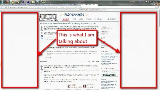
Edit 2: See this to understand what I am saying enter image description here

gnat
  • 21,442
  • 29
  • 112
  • 288
NVM
  • 689
  • 1
  • 6
  • 13
  • 4
    Well remember monitors used to be basically square? so maybe it's just kinda a standard thats been adopted. –  Mar 09 '11 at 17:23
  • 1
    @mercfh You comment actually makes a lot of sense. But what I wonder is why almost no one seems to question this fundamental usability flaw when people tend to discuss to death pointless things? – NVM Mar 09 '11 at 17:30
  • In this case, printable area without obscene side-effects, like partial lateral cut-offs being printed to seperate pages. There are alternatives, but they are not without there own set of complications (CSS print media type). – JustinC Mar 09 '11 at 18:15
  • Pressing + a few times will fill in the empty white space on the sides of your browser window. You can also grab either side of your browser window and adjust it to a more pleasing size. – oosterwal Mar 10 '11 at 00:49
  • @oosterwal Yes and then there will be even lesser content on the screen. I might as well replace my 24 inch monitor with an ipad to use as a monitor. Atleast I can carry the ipad around. – NVM Mar 10 '11 at 09:39
  • 1
    Doesn't this question belong to http://ui.stackexchange.com/ ? – David Mar 10 '11 at 09:43
  • 2
    @NVM how is this a "fundamental usability flaw" ? It is just "unused space". – David Mar 10 '11 at 10:49
  • Try using this website in a 24" full HD monitor and you will see the flaw. I am not sure how 'usability' is defined for a website, but if you have to scroll for more content in a website when more than half of your screen real-estate is empty, its incredibly 'unuseable'. And I keep coming back to 24" wide screen monitors because these are not as unusual as people think. I got two for less than $200 each. – NVM Mar 10 '11 at 10:55
  • @NVM Based on the empirical I linked to, they are also not as common as you seem to think. It is important to note that 1080p usage has gone up almost 500% in one year (going from ~1% of all users to ~6% of users), if that growth rate continues we will definitely have to explicitly support that resolution on future projects. – Berin Loritsch Mar 10 '11 at 12:58
  • I usually hate it when a website tries to use every space available. It just looks too bloated and it's hard to find things (and read without being distracted by all the other content (especially flash ads)). Think of it as if you had to read a book where the text used the entire page, with no margins whatsoever. – gablin Mar 10 '11 at 13:26
  • @gablin Its a problem of with the website not being correctly designed. Not a problem of having and using the extra space. – NVM Mar 10 '11 at 13:37
  • As a web designer of 10+ years, I have always designed websites to fit 800px width. It is only in the last few years I have started using 1024px width in designs. It is only recently that monitors with widths greater than these have started to become common. Many websites you browse today were designed many years ago, back when widescreen monitors were not all that common. Also many designers continue to stick to their old habbits of designing for smaller resolutions. With mobile devices increasing - sticking to these habbits is not a bad thing. – Gavin Coates Sep 17 '12 at 11:20

14 Answers14

36

There's a limit to how far the eye can scan without losing track of what line is next when you get to the end of the current line. There's been a number of studies (including this one) about optimum line width and readability.

You might be able to boil it down to degrees, but in order to know what is optimal at that point requires you know how far the user is from the monitor. That's why most recommendations are for measurements in ems, characters, or words. The size in pixels is then dependent on the size of the font, but the general consensus still works.

I personally would have a very hard time reading an article if it was formatted to use the full width of a 1080p screen. I'm sure you would as well. Our current conventions are derived from print layout design guidelines, and the layout guidelines haven't materially changed. The only difference is that we can interact with the page in a browser.

Additional commentary: (from question posed in comments)

There are limitations to what HTML can do for you on a screen. For one thing, there are no pages. Only scroll bars. Designing a reasonable behavior for how a browser should display markup is a very difficult proposition. The CSS3 properties for multi-column layout haven't made it out of candidate recommendation stage yet. There are hacks to play with it described in this article at a list apart. However, it's just not quite ready for prime time on most sites yet.

As long as your content doesn't require scrolling you should be OK. As soon as it does, the multi-column approach can present some challenges on how the user interacts with the site.

Commentary on the Current De Facto Standard:

To address the way you reworded your question, and the example you provided, understand that web design has to balance a number of potentially conflicting requirements--and still keep the website looking professional. In order to balance the needs of the designers and the clients, most development houses design for one resolution. That resolution is based on data that can be readily available. They can also be based off of historical web traffic records, or knowledge of the target environment.

The most common screen widths (1024, 1280, 1366) are close enough so that if you design for the smallest (1024p) and center the design on the page, it will still look nice on the other slightly larger horizontal dimensions. It is very difficult to get everything aligned right in any format, much less have to support multiple formats depending on the screen width. 1080p users are growing in number, but still make up a very small percentage of everyone they have to support.

In case you are interested, I highly recommend perusing some of the design articles at "A List Apart". You'll start to get the idea that doing what you want is more difficult than it looks. When I posted a question about designing for 1080p, the first initial responses amounted to "Make everything bigger". It's something that just hasn't been on the radar for most web designers yet.

Berin Loritsch
  • 45,784
  • 7
  • 87
  • 160
  • So why not somehow break things up like two columns in a book rather than have absurd whitespace on left and right of the actual text. You will realize this absurdity when you use a full hd monitor in landscape. – NVM Mar 09 '11 at 17:32
  • 3
    This site uses a two column design, and some web sites have three column designs as well. What I described is the physical limitation to a single column. There are technical reasons why you can't do in HTML what you can in print. For example, HTML and CSS does not give you the option to flow text from one column to the next. Nor is there the concept of pages on a screen. You have to come up with the rules of how the scroll bar works, etc. and it just doesn't convey. – Berin Loritsch Mar 09 '11 at 17:36
  • 4
    Using mulitple columns works fine in print, because you know how high the page is, but it doesn't work so well with an unkown screen size - you don't know how far down the break to the second column will occur. Vertical scrolling is easy, but it works best with a single column of text. Multiple columns work best with discrete pages (rather than continuous scrolling). – Stephen C. Steel Mar 09 '11 at 17:42
  • Super explanation and I think the last line sums it up pretty well. – NVM Mar 10 '11 at 11:03
  • Thank you. I am among the active few that is actively considering what it means to use all that extra space. On one hand it's a lot, but on the other it's not quite enough to do some of the things I had in mind. – Berin Loritsch Mar 10 '11 at 13:00
  • 1
    It is maybe also worth pointing out that not all people browse the web with their browser open full screen. I am using a 1080p monitor, but have the browser open in a window set to just slightly wider than the page I am viewing (90% of sites are of a similar width and fit this window just fine). this allows me to keep other windows open down the side of the browser. – Gavin Coates Sep 17 '12 at 11:03
  • @GavinCoates: I also never maximize applications, plus I have all webpages zoomed into 150% so they're easier on the eyes. – whatsisname Sep 17 '12 at 16:28
27

Most websites are Taller then they are wide because you can scroll down naturally to read more content. I personally HATE horizontal Scroll bars. They should be abolished!

Website are still portrait, the site extends be beyond the bottom of the screen. There is No limit to how tall a site can be.

There are now infinitely long web pages (Thank you, AJAX), What would you do if you saw an infinitely Wide page? (I would hunt down and Kill the designer, clicking away from the page is not good enough, the designer must die.)

Scrolling across then back for each line will drive one to suicide. This is why people make fancy book like, page turning apps, so you don't have to scroll across.

Morons
  • 14,674
  • 4
  • 37
  • 73
  • See edits in my question. – NVM Mar 09 '11 at 17:11
  • No, the content must stay in the same place regarding the screen resolution. Are you really suggesting the a website should be coded to check (the screen resolution to see) if content can fit "Above the fold" then move it to the right of the existing content if it can fit? – Morons Mar 09 '11 at 17:16
  • In WPF Silverlight these days you have the expand to fit kind of design. Things will resize based on available space. Why not similar? I am not suggesting a some cut paste job but since this affects just about everyone why noone seems to be discussing it. – NVM Mar 09 '11 at 17:26
  • 1
    Infact I use two 1920x1080 monitors in portrait mode and I am loving it. It was hell when I had one in landscape. And I am certain less than 1% use monitors in portrait when everything on the web is built for it (except videos but except for Youtube how many people watch serious video on monitors and for youtube it doesnt really matter anyway) – NVM Mar 09 '11 at 17:29
  • All text wrapping "auto-fits" to your screen width. Most websites are designed with percentage width not fix pixel width so they "auto-fit". (Now, I think i may be properly understanding the question) – Morons Mar 09 '11 at 17:32
  • "All text wrapping "auto-fits" to your screen width" Thats the point it doesnt! Websites generally don't expand beyond a certain width. And even when they do they don't do it gracefully. Just have a look as CMS templates that you can buy off the shelf. – NVM Mar 09 '11 at 17:43
  • I updated the question with a snap of this very site to show what I mean. – NVM Mar 09 '11 at 18:04
  • 3
    Actually, an infinitely horizontal scrolling website might not be *so* horrible (punishable by something not as sever as death) if instead of a single line potentially having infinite width, the content is broken into reasonably sized columns and the number of columns is potentially infinite... – FrustratedWithFormsDesigner Mar 09 '11 at 19:11
  • @FrustratedWithFormsDesigner Exactly. Its like the earth is flat belief. People seem to think that the only thing you can do with horizontal space is have text line with a huge width. There are so many ways of organizing/designing a website so that it makes optimal use of available width. – NVM Mar 09 '11 at 19:57
  • @FrustratedWithFormsDesigner ->"content is broken into reasonably sized columns" is the same as the "Book Page turning" I mentioned. – Morons Mar 09 '11 at 20:18
  • @Morons: Similar. It would scroll forever horizontally, rather than ony displaying 2 pages at a time. And I think the book-turning would be a lot more pleasant to use. :) – FrustratedWithFormsDesigner Mar 09 '11 at 20:22
  • http://worlds-highest-website.com/ – Martin Mar 10 '11 at 00:21
9

After reading the previous answers, I notice that several points are missing, so I'll try to describe those.

Difficult columns implementation

When you talk about large-width pages, I imagine that you're talking about text columns, like what you see in a "physical" newspaper. There are two problems with that.

First, actual HTML 4 and XHTML 1.0/1.1 are not intended to display text in columns. There are hacks for Firefox (and maybe other normal browsers), but it will not work in Internet Explhorror.

Second, in actual Firefox implementation or in future HTML 5, if the text must be displayed in columns, you must specify the width of the column and the number of columns. It is not possible to specify the height (to, for example, the height of the page, minus the height of the header and the height of the footer), and let the browser adjust the number of columns.

It makes it practically impossible to have an usable layout in columns with only horizontal scroll-bar, without the vertical one.

No 100% height

Actual HTML/XHTML is intended to adjust the size of the elements according to the width of the page. It's very difficult to use the page height for metrics.

This means that you will have to use JavaScript hacks to display the content correctly. In other words, for people who don't have JavaScript enabled, your website will be completely unusable.

Browsing with half-screen page

With large 16:9/16:10 screens, it is not unusual to work with two windows side by side (Win + / Win + in Windows Seven). This means that the browser window will have a small width and a big height.

Fixed vs. dynamic width

Your assumption that most websites are optimized for viewing in portrait mode may be wrong.

First, most websites are not optimized at all and are written by people who don't know anything or little about web development in general.

Second, there is a difference between websites with fixed width and websites with the width which is equal to a percentage of the width of the browser window.

In the first case, you may notice that most websites are not optimized neither for portrait, nor for landscape mode. Usually, the width is fixed to 1024, 800 or less, which doesn't make any sense when viewing them on a 24 inch screen with 1920×1080 resolution.

In the second case, if you are viewing the page in full-screen mode on a 24 inch screen, there are chances that this website will be displayed correctly in portrait as well as in landscape mode.

Example : imagine a website with a gallery of photos. On a page there are thumbnails, and when you click on a thumbnail, you see a full-scale photo. If the thumbnails are float-lefted, with a dynamic width of a page, it will display nicely in landscape mode. It will be especially nice to see the full-scale photos.
zzzzBov
  • 5,794
  • 1
  • 27
  • 28
Arseni Mourzenko
  • 134,780
  • 31
  • 343
  • 513
4

Why are modern monitors oriented in landscape mode?

  1. Video format. HD video will scale better for landscape oriented displays.
  2. Reading. Whether left to right or right to left, its easier to read large blocks of complete lines without any scrolling when oriented in landscape mode.

EDIT: After reviewing your comment, and reframing the intent of your original question, it seems you are sort of aiming for some reason for the two and three column layout that is most common today. For this a brief, little summary of website history:

Why are websites optimized for viewing in portrait mode?

I don't think they are optimized for it at all. It's often a compromise between having certain aspects always available, certain aspects often available, and certain aspects available only within a certain context. At best, you could it an call optimal compromise.

Being able to place core, expected navigation and secondary content in each page alongside context specific content is why two and three column layouts are as pervasive as they are. In the earlier days of web, many sites experimented with layouts which offered what attempted to appear as single column layouts, using dynamic navigational lists (or menus, however you want to see them), that would hide themselves and expand the reading area for the main content. But it was a two part challenge: a) technical challenges in lack of cross browser compatability; b) usability: it was often viewed by users, even if (a big if) the technical challenge was overcome, as unintuitive or an unncessary game of hunt (for navigation) and destroy (experience satisfaction because some solutions modified the default context behavior of mouse clicks).

To overcome this, most sites have adopted a defacto standard, and accepted the consequences. Either two columns displaying navigation in one and content in the other, or a third column is added so secondary, non core navigational content can always be displayed (whether its context related help, notes, or advertising, or more recently communication streams showing live person activity related to the site or context). The actual content of the context is stuck in the middle.

JustinC
  • 3,306
  • 17
  • 20
  • Sorry but I don't understand this. "its easier to read large blocks of complete lines without any scrolling" So many websites I've seen have empty spaces on the left and right with some sort of maximum width defined. Basically it stops you from using the full width of the screen and is precisely why I asked this question. – NVM Mar 09 '11 at 16:57
  • Maybe he meant that very very very wide lines are harder to read? I'm not sure if that's what he meant, but I'd agree with that. – FrustratedWithFormsDesigner Mar 09 '11 at 17:01
  • Infact I also dont understand the first point. How does monitor orientation have any effect on video scaling? – NVM Mar 09 '11 at 17:02
  • @NVM Full screen HD video fits best in landscape mode, wider than taller. Least amount of letterbox. – JustinC Mar 09 '11 at 17:53
3

This is called fixed width layout. There are full width layouts or also called as fluid. There is a reason why fixed width used. One is that resolution of your monitor affects usability. If you have a huge monitor like I do at 27" the site would look horrendous. All the text, pictures and everything would be so spread out, it would be hard for me to get a grasp of the layout or site. A fixed layout allows for beautiful design. Fluid layout is used mostly in listing or data type of sites. For example eBay uses fluid layout in its listings because it provides for a better experience. Forums could also benefit from fluid layout. But blogs, creative, photo, or business sites benefit much better from fixed width sites.

user5248
  • 199
  • 3
2

I suppose that in general it is discouraged to post an answer in thread that has not seen activity for a long time. I feel, however, that there are some relevant things that have not been mentioned yet.

First, let me mention the following Firefox extension that I discovered several months ago: Column Reader

https://addons.mozilla.org/en-US/firefox/addon/column-reader/

Why do we scroll vertically?

For comparison: consider a language that is written in vertical columns. For a language like that the current wide-screen monitors are ideal. So that is how it works out: you scroll perpendicular to the direction of your lines. Book pages are in portrait format because our lines are horizontal.

As has been pointed out in earlier answers: the reflow capabilities of our browser's layout engines are tuned to reflowing vertically.

multi-column capability

The development team of a browser may opt to add multi-column capability in the following way: First render the entire page as a single column, then cut that into strips with the pixel height of the available window space, and display those strips side-by-side. But how wide do you make the columns? Even when very little width is used for actual text, often the page codes for a particular background color for the entire width of the available window space.
Then the rendering engine must play safe, and allocate the entire horizontal space to a single column.

Is it possible for webdesigners to implement a reflowing multi-column layout?
That would run into severe difficulities. You have to obtain the height and width of the available windows space, and do the cutting and arranging of strips into columns in Javascript. Then you must decide what to do with images that are cut in two pieces.

Dealing with that sort of thing is what a layout engine does. To try and create a Javascript library that facilitates reflowing multi-column layout is to create a rendering engine in Javascript. That's creating a platform-in-a-platform.

Monitor size

I find it frustrating that in effect computer monitors have shrunk the last couple of years. Large monitors had 1200 pixels of height, nowadays only 1050. Yes, they're wider, but for text that space cannot be utilized.

Also, in portrait orientation those monitors are too narrow.
I have a dual monitor setup, with both monitors in portrait orientation, both monitors are 1200x1600px. For me those 1200 pixels are a minimum.

A conditional statement in CSS

A remark about fixed width layouts.

I love the CSS command that allows the web-designer to accommodate a large range of widths while avoiding scrollbars and maintaining readability: "max-width". (There are four commands like that: min-width, max-width, min-height, max-height). For a div containing text specify a max-width of, say, 65em.

You get an if/else.
If the available space is less than 65em then the text is reflowed accordingly: no horizontal scrollbar If the available space is more than 65em then the containing div is set at 65em.

Cleonis
  • 121
  • 3
2

I don't know for sure, but my guess is that most "documents" that are printed are designed to be printed in portrait-orientation, and many people still designe websites as "documents" - this might be a cultural thing? Another possible explanation is that monitor-width varies more than monitor height...

FrustratedWithFormsDesigner
  • 46,105
  • 7
  • 126
  • 176
1

Widescreen monitors have really only taken off in the last 2 years -- they used to be the more expensive options.

Design-wise, it has always been viewed that having a web page (document) go long so that a user had to scroll down is vastly superior to making someone scroll across for a few reasons. First, this is the way most computer documents tend to work, so it is a more "normal" pattern; you have a page down key but not a page across key. Second is we've got nearly ubiquitous mouse wheels these days, so scrolling up/down is a very easy activity, vastly easier than scrolling across.

Finally, how do you pick what widescreen resolution you'd like to hit -- my desktop is 1920x1080; my laptop is 1440x900. Which one do you design for?

Wyatt Barnett
  • 20,685
  • 50
  • 69
  • What websites can you name that haven't had a facelift in more than two years. Even the new websites have the same 'problem' If I had my way I'd get the UI to adjust based on the end users resolution. ie it would be optimised for landscape if the you have a full HD in landscape and for portrait if you use it in portrait. – NVM Mar 09 '11 at 17:08
  • Monitors are 3-5 year lifecycles. Moreover, people are used to portrait-oriented sites -- find a side scroller, watch people use it. They tend to try and scroll down before figuring out how to go across. – Wyatt Barnett Mar 10 '11 at 11:42
1

While its true that most monitors are landscape in orientation that are being sold today you also must take into account that when you design a website you have no way of knowing exactly what screen resolution the viewer will be using. There's still 15% of internet users who are operating on a screen resolution of 1024 in width or less. This doesn't leave a lot of room for horizontal expansion before you have to scroll to see the information. Plus some users don't surf the internet in a fully maximized window. The only solution to this problem is to develop a design that is dynamic based on the size of the browser window. If you have ever attempted to do this you would be very hesitant to attempt it again unless absolutely needed as its a royal pain. There are many other reasons to have a smaller width as have been already mention.

Kenneth
  • 2,703
  • 2
  • 21
  • 30
0

There are a number of reasons:

  • Documents of mostly text are traditionally portrait ratio, so the web preserves that.

  • It is easier to read shorter lines of text. I don't have a cite, but it is a very common piece of design advice, to the point of being a standard more than a guideline.

  • A design that favors narrow is more flexible. I like to window my browser to only half of my wide screen monitor's full screen, and put something else (usually a text editor or another browser window) beside it. Just because I can have a web page be 1920 pixels across doesn't mean I always want it to be. Its actually a bit presumptuous of a web designer to make any assumptions about how I will (or should) view their page. Gives me bad flashbacks to "This page is best viewed in 800x600 on IE6."

  • A better choice would be a liquid design that scales to any width, and CSS makes that work well for text (most of the time, in most modern browsers, maybe). But images, embedded video, flash, and other modern embedded objects always screw up that kind of design without a lot of work. Given the choice between a flexible scaling design that takes a long time to get right vs a tried and true narrow fixed width design, quite a few people would opt for the easier (cheaper) path.

  • The most flexible choice is something like iGoogle, a user-adjustable web part canvas. Then your text can be as wide or narrow as you want, with blocks of text and images arranged how you'd like. Now I'd like you to imagine the nightmare of every site you visit requiring customization before it's readable.

CodexArcanum
  • 3,421
  • 21
  • 23
0

For now the web design standard for sites is to develop in 960px wide to accomodate screen resolution of 1024px and up (without horizontal scrollbar). This is the minimal requirement since not everyone uses a shinny new 24 inches monitor. (think of tablets and netbooks which are new hardware with small resolutions)

You should keep in mind that the resolution of a web site desing is impacted by the targetted audiance and should be adapted accordingly.

Also in term of usability the lines of text should be around 11 to 14 words wide (can be more if you adapt the line-height) so not all website can handle fluid design.

At best if you don't want to give your visitors the feeling that the page outside the content zone is not empty you can add texture/color strippes that extends beyond and that adapt to the size of the user's screen. (like on http://www.cnn.com/ which only applies to the header, but you could make it for the whole page)

JF Dion
  • 530
  • 3
  • 12
0

Why are most websites optimized for viewing in portrait mode?

Why do we print paper in portrait mode when landscape is a perfectly viable option as well?

As many people have said, it is easier to read a larger number of short lines than it is to read two or three long lines.

Aside from that, if you were to fill 1280*x pixels with content, the webpage would be cluttered and nobody would know what needs to be addressed. A webpage should perform a specific task, not EVERY task.

Web 2.0 trends teach us to put less information on a page, and make the call-to-action clear and concise. This commonly accepted design philosophy is the exact opposite of what you're suggesting.

There are MANY reasons to develop for a 1024 resolution, but I think the clutter factor is one of the more important ones.

Craige
  • 3,791
  • 21
  • 30
0

I've noticed that you're using what looks to be Windows 7, so the answer is: Win +

On a serious note though: The primary reason websites are optimized vertically is that it's easier to code a static-width layout in CSS and have it look correct cross-browser on multiple platforms. Fluid widths are used occasionally, but they don't lend themselves to readability.

When watching a movie or playing a game, it's great to use up all your horizontal space with stuff, but with reading, you really only want a small column of text so that the eyes can scan naturally without needing to turn the head. Adding more crap on the left and right of a webpage will tend to distract from the primary content of the page, so many designers just leave it blank to have attractive white-space.

Additionally, just because you have a nice monitor doesn't mean that the majority of people have a nice wide-screen monitor. A great resource to check layout sizes on is google's browsersize.

zzzzBov
  • 5,794
  • 1
  • 27
  • 28
-2

Your monitor is oriented incorrectly. A programmer's monitor should be higher than it is wide, in portrait rather than landscape.

  • 2
    -1 because a) this is a personal opinion, b) it is stated as fact, and c) you don't site any sources. If you're going to make a claim, back it up with facts. Finally, no programmer I know (and having been a programmer for 20+ years, I've known plenty) have ever had a monitor setup that is in portrait mode. Landscape (and/or multiple monitors in a single row) allow you to have both an editor or IDE open, plus a browser, or a two-pane diff/merge tool, etc. – Bryan Oakley Sep 16 '12 at 21:41