62

I was reading the wikipedia article on programming style and noticed something in an argument against vertically aligned code:

Reliance on mono-spaced font; tabular formatting assumes that the editor uses a fixed-width font. Most modern code editors support proportional fonts, and the programmer may prefer to use a proportional font for readability.

To be honest, I don't think I've ever met a programmer who preferred a proportional font. Nor can I think of any really good reasons for using them. Why would someone prefer a proportional font?

Tamara Wijsman
  • 8,259
  • 14
  • 58
  • 94
Jason Baker
  • 9,625
  • 8
  • 44
  • 67
  • 11
    I like proportional fonts for reading, but I strictly use monospaced fonts for code. Always, always, always. – Frank Shearar Sep 20 '10 at 08:08
  • 13
    To also quote Wikipedia: `[citation needed]` :) – dr Hannibal Lecter Nov 06 '10 at 17:31
  • 7
    Many years ago, a prof I had in college half-jokingly said "... because it's not programming unless it's courier new." – Steven Evers Nov 18 '10 at 15:58
  • 16
    My reason for using a proportional font is very simple. It’s not the 1980s anymore. We’ve moved on from character terminals. Newspapers, books and websites generally don’t use monospace fonts for reasons of readability. I think they have a point. – Timwi Feb 20 '11 at 00:07
  • A related challenge is how you deal with Japanese or Chinese characters in source code (comments, strings). They really need to be double-width for readability, but that messes with several monospace assumptions. – Craig McQueen Feb 28 '11 at 01:23
  • I honestly don't generally care what font I use - as long as the type is large enough. – Amy Anuszewski Sep 24 '11 at 21:54
  • 4
    It's clearly unpopular, but entirely unnecessarily so. Monospaced fonts suck, and there are [better ways](http://nickgravgaard.com/elastictabstops/) to achieve vertical alignment than monospaced. Much better: ever had incompatible tab widths in a file? That's just 70s kind of dumb. – Roman Starkov Feb 28 '12 at 10:34
  • 6
    Verdana 11px is great. – Czarek Tomczak Apr 09 '12 at 15:29
  • I like variable width fonts (usually Verdana) and am in that habit for certain languages PHP/Python/VB6. Love the point about elastic tabstops, had my eye on that for years as what would make my font choice work really well, but I don't use it. – zanlok Nov 01 '12 at 07:33
  • I use Verdana 11 for all of my coding – David Stone Dec 13 '12 at 03:43
  • I use Trebuchet for my coding. I have been using for a pretty long time and I really like it. – Ravi Wallau Jan 22 '14 at 18:47
  • 1
    Designer of Input font makes [great points](http://input.fontbureau.com/info/) in favor of proportional fonts (but specifically designed for code). – Beni Cherniavsky-Paskin Jun 01 '15 at 11:49
  • There's even a monospace version of Comic Sans for people who don't like having others looking at their editor over their shoulder... – Mark K Cowan Jul 30 '16 at 18:48
  • I love Googles free Noto Sans. It's very similar to Calibri, but it has distinctly different characters for |, l, I and o, O and 0. I'm still looking for a visual studio plugin that only VISUALLY vertically aligns lists of assignments. – realbart Mar 16 '17 at 17:16
  • @realbart • [Elastic Tabstops](http://nickgravgaard.com/elastic-tabstops/) for Visual Studio – Eljay Nov 11 '19 at 15:02
  • Closed so can't answer but here's the one good reason I can think of. When defining formatting guidelines, a font agnostic metric for max line length such as an 80 column ruler is not possible with variable width fonts unless the font to be used is also dictated in the guidelines. Wherever this doesn't matter proportional fonts seem equally good. – trss Mar 03 '21 at 18:01

11 Answers11

53

Common points against proportional fonts, commented.

  • You cannot precisely align code vertically with proportional fonts. I mean, you could precisely align code vertically with proportional fonts, if everybody was using elastic tabstops, but alas...
  • Some proportional fonts make it hard to distinguish some characters groups. (e.g., mrnm). Not all programming fonts are perfect either, however: Courier New has identical 'O' and '0' and identical '1' and 'l'.
  • Some IDEs have poor support for non-fixed-width fonts (like aforementioned Visual Studio or Python's IDLE). In some contexts, also, you just can't use one. (e.g., terminals.)
  • Choosing a proportional font for coding will get you in endless holy wars. Here, however, the problem exists between the keyboard and the chair.

Points in favour of proportional fonts

Personally, I've been using both the 'Ubuntu' font and WenQuanYi Zen Hei Mono with pleasure and find myself unable to prefer one to the other. :)

Ubuntu
WenQuanYi Zen Hei Mono
Ubuntu 10 and WenQuanYi Zen Hei Mono 9, compared. There's no clear winner here, if you ask me.

That said, fonts are like food. Some like them well rounded, some like them hot and spicy -- there's no one right font, or all of us would be using it right now. Yay for choice!

mikemaccana
  • 696
  • 5
  • 9
badp
  • 1,870
  • 1
  • 16
  • 21
  • I didn't realise that the Ubuntu font had been released. I think it works well there. – Alan Pearce Nov 18 '10 at 15:34
  • +1 for showing me WenQuanYi Zen Hei Mono, that font is amazing. I’ll almost certainly use it in my thesis. Depends on how well it looks printed – on screen it looks amazing and doesn’t take a lot of horizontal place, which is very important in print. – Konrad Rudolph Jan 28 '11 at 22:09
  • 14
    Really, there's just one big fat point against proportional: you can't really align because nobody cares for elastic tabstops. Which is utterly odd, given how it benefits **both** the monospaced die-hards and those who actually prefer reading good-looking variable-width fonts. Come on, world! Elastic tabstops! – Roman Starkov Feb 28 '12 at 10:30
  • nothing beats `Inconsolata` –  Apr 09 '12 at 18:09
  • 7
    @romkyns: Adopt an indent style that doesn't rely on lining up with other lines. Simple. – Zan Lynx Apr 09 '12 at 22:28
  • 4
    @ZanLynx I did, because I like proportional fonts more than I like vertical alignment at places other than the start of the line. – Roman Starkov Apr 11 '12 at 18:47
  • @romkyns: even with monospace fonts you have the problem of alignment as it depends on spaces vs tabs and tab sizes (frankly, nobody argues about the tab size for indentation, because it doesn't matter). – ybungalobill Dec 01 '16 at 12:04
  • 1
    @badp Have you found a proportional font where you can distinguish two single quotes from a double quote? I would love to try using a proportional font, but this issue has always held me back. Neither of these are the same: '''', '"', "", "'', ''" (`'''', '"', "", "'', ''"`) – Jan Aagaard Mar 06 '19 at 13:34
  • 1
    @JanAagaard I use editor colour for that. Single quote strings are pastel yellow, double quote strings are pastel mauve, and (with Verdana and Notepad++ anyway) I can pretty easily tell which is what from your example when on a black background. The last comma is mauve, for example, because unlike the rest it's actually in a string. I can also fairly easily pick out what's what from a random string of them mixed together ( `''"''''"'''''''''"'""''''''""'""''` and I can tell which is which _and_ the nesting), which is a skill I don't actually need at all because my code _never_ looks like that. – Steven Armstrong Apr 15 '20 at 22:57
  • "You cannot precisely align code vertically". Luckily I encounter this rarely these day, so it is a non-issue in my experience. Even in the days when I used monospace fonts I didn't find vertical alignment good. – towi Jun 05 '20 at 08:00
  • Your points against proportional _fonts_ are not about fonts in general. Is that intentional? Vertical alignment is an IDE/editor fault. Glyph distinguishing issues are a typographer problem. Poor IDE support is ... well ... um ... an IDE problem, right? Subjective holy wars is a human problem, as you noted. And there are no points in favor of proportional fonts except one, namely: "In my opinion, I personally, subjectively prefer proportional fonts. Just 'cuz." (For the record I despise proportional fonts in general, but especially for programming. Again, it's 100% subjective.) – SO_fix_the_vote_sorting_bug Apr 03 '21 at 14:02
34

There is a reason which makes it practically impossible to use fonts other than monospace for coding, but was not mentioned in other answers: rectangular selections.

This feature, often not very useful and not very known when working with ordinary text, is essential for developers. You may imagine a multitude of scenarios: removing // comments on several lines, adding parenthesis or other characters, etc. This is even more valuable with advanced support of rectangular selections, as in Visual Studio 2010, where you can not only select and remove text, but select and replace it.

Let's take an example:

private IEnumerable<SELove> StackExchangeRocks()
{
    var howILoveSEWebsites = new []
    {
        new SELove { SiteName = "Stack Overflow", MyReputation = 5269,  MyRating = Rating.Outstanding, },
        new SELove { SiteName = "Programmers",    MyReputation = 16937, MyRating = Rating.Outstanding, },
        new SELove { SiteName = "Super User",     MyReputation = 650,   MyRating = Rating.QuiteGood,   },
        new SELove { SiteName = "Server Fault",   MyReputation = 489,   MyRating = Rating.Good,        },
        // Initialize other websites here.
    };

    return howILoveSEWebsites.OrderByDescending(c => c.MyRating);
}

private class SELove
{
    public string SiteName { get; set; }
    public int MyReputation { get; set; }
    public Rating MyRating { get; set; }
}

private enum Rating
{
    Outstanding,
    Good,
    QuiteGood,
}

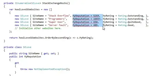
In this legacy code, I want to replace in-code rating by a method which will load my rating from Stack Exchange websites themselves, being able to always have an up-to-date data. I started to refactor the MyReputation property, and now I want to remove the initialization, in scope. Imagine that I have not four, but all 84 SE websites.

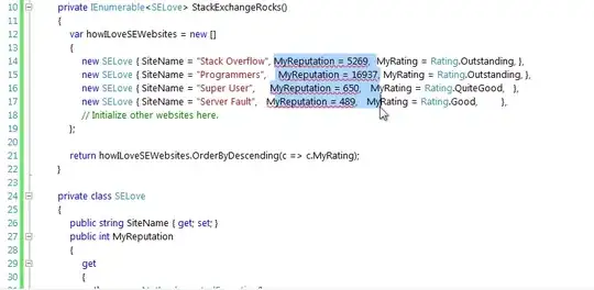
Here's what happens when using Consolas, a monospace font. I press Backspace, and that's all, I can spend the remaining time to do something actually useful.

The image shows that with Consolas, the rectangle selects reputation property.

And here the same thing with Segoe UI. Ouch!

The image shows that with Segoe UI, some reputation properties are selected only partially, while on other lines, the beginning of rating property is selected.

Arseni Mourzenko
  • 134,780
  • 31
  • 343
  • 513
  • 1
    Excellent point. I rarely ever use rectangles, but when I do, they're indispensable. – Jason Baker Oct 02 '11 at 16:49
  • Have you actually tried it? It works perfectly well with a proportional font in Visual Studio 2010. – Roman Starkov Feb 28 '12 at 10:27
  • @romkyns: maybe you're talking about Visual Studio 2011 Developer Preview? I edited my answer to show what happens in VS2010. – Arseni Mourzenko Feb 28 '12 at 12:04
  • 11
    This happened because you used spacing that happened to match the monspace font. If you had proper spacing w/r/t the proportional font, you wouldn't have this problem. – Kos Apr 11 '12 at 19:30
  • 6
    @Kos: so instead of pressing, say, three tabs, you would press fifteen times the space key, than notice that you typed too much, and remove the last space? Seems a bit too complicated, don't you think? – Arseni Mourzenko Apr 12 '12 at 02:26
  • 1
    You basically have 3 options to indent `MyReputation`: in spaces to be aligned in monospace, in spaces to be aligned in your proportional font, or in tabs be aligned in both (assuming you have proper tab stops- some help from your editor is needed here). My point is: if you indent that with spaces, monospace and proportional are just as good. – Kos Apr 12 '12 at 09:02
  • 1
    A lot of editors do not support rectangular selection. I also don't like when others trying to arrange everything in a matrix, because you need to rearrange the entire damn thing when adding a long entry, or worse you skip letters because you are too lazy to rearrange the matrix. – Calmarius Jul 25 '12 at 19:37
  • 6
    Eclipse actually supports using a different font for rectangular select mode, which makes this less of a problem. – Nicholas Aug 19 '12 at 17:11
  • 1
    @Calmarius Most editors do, actually. Even the Windows Command Line supports rectangular selection. Offhand, I know that Notepad++ does, Visual Studio does, SublimeText does, and vi does as well. –  Feb 21 '13 at 04:30
  • emacs too, of course. – asthasr Dec 22 '13 at 22:24
  • 8
    @Kos RE: "proper spacing w/r/t the proportional font": But then if a different programmer uses a different font on the same file, it won't line up. If all editors use monospace fonts, it'll always line up (assuming the code doesn't abuse tabs for alignment). – Max Nanasy Aug 22 '14 at 01:01
  • This is just a matter of using a proper editor; even MS Word has rectangular selections. One could just take sequences of spacing to mean "line up what comes after these spaces". (see also elastic tabstops, which work great with proportional fonts) – Clément May 01 '15 at 14:34
  • This is a good point for the font used inside your editor or IDE, but it doesn't apply as strongly to the font used simply for presentation/display of code: for *reading,* as on a webpage or printed book (see answer about Stroustrup's book below), as opposed to *writing* or editing code. – ShreevatsaR Sep 26 '16 at 20:31
  • 10
    I'm using a proportional font for 2 years without any elastic tabstops. I do not use rectangular selections because there is something else that completely replaces it in most IDEs: multi-caret selection. In this example I would select "MyReputation = " then press Select next occurrence using `CTRL-D` in SublimeText and VSCode, `ALT-J` in IntelliJ / JetBrains editors. Next, `SHIFT-CTRL-RIGHT ARROW` to expand the selection to the next token at the right and it's done. Main advantage is that no one needs to align stuff to edit. Disadvantage, if you have something aligned, it will no longer be. – Hay Oct 02 '16 at 19:30
  • 1
    The practice of aligning code like this has its own problem: If one of the lines needs more space, then you have to update all the other lines too. No biggie, you might think, but in my experience these things are often forgotten when you are working in big teams, resulting in code that is partially aligned. – Jan Aagaard Mar 06 '19 at 13:31
  • @JanAagaard: unless your auto-formatting rules are set in a way that the alignment is done automatically by the editor. – Arseni Mourzenko Mar 06 '19 at 15:37
  • 1
    To take advantage of rectangular selection, you have to take the time to align the properties and then realign them as code changes (e.g. a `SiteName` value changes in your example). You only get payoff from the prep work when you do a rectangular selection, which will be some fraction of the time you spent doing all the alignment. Is the alignment effort. and correspondingly the horizontal space and typographical readability lost by using a monospaced font, worth it? – Edward Brey Oct 10 '19 at 13:17
  • To use this, you must break the golden rule of coding... **Don't Repeat Yourself.** I could rewrite your entire example in Haskell to comfortably fit in a SE comment. Probably even have room for language pragmas. It would look ugly because of the semi-colons needed for a correct definition without newlines, but very doable. – Steven Armstrong Apr 15 '20 at 23:42
  • Aha, interesting example. Luckily I use "add next match to selection" to introduce multiple cursors. That very often works even better then rectangular selections. I use this in Emacs as well as in IntelliJ. If I look at you "positive" example you rely on "pertect vertical alignment" of items (which I don't find a good idea). If you use "add next match to selection" that a) works perfectly without aligned sourcecode and b) with proportional fonts. – towi Jun 05 '20 at 08:04
  • This is _not_ a font spacing problem, it's an editor problem. This is like claiming: "Arial is better than Courier because my typewriter has Arial typebars and it takes me too long to swap them out with Courier typebars." Or: "Hand print characters are better than handwritten cursive because I can't read cursive fonts." It is so bizarre that people answering this question here on SE can't tell the difference between physical font spacing on a monitor and an IDE software package. Also, am I making any sense or is my take just a bunch of salty griping? – SO_fix_the_vote_sorting_bug Apr 03 '21 at 14:12
  • @jdk1.0: fifteen years ago, serif fonts weren't used much on computer screens, because serif fonts were difficult to read and looked ugly on low-resolution monitors. Following your logic, a designer would say: “hey, the resolution of modern monitors is the problem of the monitors, not mine, I'll use serif fonts everywhere.” Essentially, font choices have to be adapted to the environment. If many persons use stupid IDEs which can't do proper rectangular selections with proportional fonts, it *is* a perfect reason to use monospace fonts. Once IDEs evolve, we'll have a larger choice of fonts. – Arseni Mourzenko Apr 04 '21 at 21:01
16

I used to use a proportional font, mostly because I find punctuation is actually easier to differentiate, but over time I've given up because nobody else does it and everybody unconsciously assumes mono spaced fonts (as the wikipedia article mentions, trying to do tabular formatting, ascii art in comments and so on).

Plus, issues in Visual Studio, that Microsoft don't want to fix, basically make it impossible to use well-designed proportional fonts anyway.

Dean Harding
  • 19,871
  • 3
  • 51
  • 70
  • 10
    Love your comment mini-battle with microsoft on that bug. And their cheery response which is basically "Hi! Thanks! Great to meet you! We're gonna do nothing. OK, thanks lovely to chat with you!" Just imagine if people acted like that in real life... – danio Sep 20 '10 at 11:24
  • 2
    You get an upvote for sympathy, since, though I don't use a proportional-width font for some of the very reasons you cite, my inner typographer constantly yearns for proper editor support, in design and programming alike. – Jon Purdy Sep 20 '10 at 11:55
  • Weird, I was just thinking that punctuation is actually *harder* to differentiate (particularly full stops) because it takes up less space. I also remember that Notepad++ used Comic Sans MS on comments for the longest time. – DisgruntledGoat Sep 22 '10 at 11:28
  • 6
    If you find punctuation hard to identify in a monospace font, there are other monospace fonts - it doesnt mean you need to use a proportional font. – Nobody Nov 18 '10 at 15:45
  • Exactly for better punctuation, I sometimes use EnvyCode [A](http://damieng.com/creative/typography/envy-code-a) or [B](http://damieng.com/creative/typography/envy-code-b). – zanlok Nov 01 '12 at 07:35
  • The link on “issues in Visual Studio” doesn't work. What are the issues? Are they still there? Why doesn't Microsoft want to fix them? – matj1 Feb 10 '22 at 13:35
11

Personally I don't care. As long as you keep my tabs aligned and the font legible, I couldn't care less whether I use monospace, proportional, or some other off-the-wall spacing. Just don't start substituting my tabs with spaces, and you'll have no quarrel with me.

Aeo
  • 885
  • 5
  • 10
7

I use a proportional font (Arial is the best I've found so far, Verdana a close runner-up) and honestly I'm still bemused that people use fixed width fonts; why would you want to sacrifice readability like that? I could understand if tabular formatting were desirable, but it isn't, since it creates a maintenance nightmare regardless of font.

rwallace
  • 1,198
  • 11
  • 19
  • 4
    I’m surprised you like Arial and Verdana. I find them a bit rough and unprofessional. Have you tried Calibri? – Timwi Feb 20 '11 at 00:05
  • 2
    I'm using 8pt Verdana. Long identifier names are easier to read. I can view 70 lines of code without scrolling and lines are much shorter, so the code is a narrow column, like in a newspaper. This enables me to split the editor's view into two vertical columns: I view the declaration in one view and write code in another. Also when debugging, the screen is full with debugging windows, the code view fits in the small space. Using proportional fonts is remove the desire to vertically align things and put ascii boxes of asterisks around the comments. – Calmarius Feb 27 '12 at 20:59
  • 2
    I see 147 lines of code in Visual Studio on a 1920x1200 monitor rotated 90° for a portrait mode, using with Lucida Console font. – zanlok Nov 01 '12 at 23:03
  • 158 lines with Monaco font in Vim... My screen isn't even HD – Mark K Cowan Jul 30 '16 at 18:53
5

I remember in Bjarne Stroustrup's book The C++ Programming Language, propotianitely spaced fonts was used for code. (I am unable to find any sample pages on the web)

I don't remember the exact reasons, but think he mentioned this and one another change (I think the C++ language itself) as a new introductions in that book.

Personally, I prefer fixed space ones. Consolas is my favorite.

Nivas
  • 526
  • 2
  • 5
  • 1
    Checking page 5 of my Special Edition: proportional fonts are generally considered as better for text, using them allows fewer illogical line breaks, and most people get used to it. I find it easy to read. Stroustrup is presenting code here, not trying to create it, and that may make things different. – David Thornley Dec 30 '10 at 16:18
  • 4
    @David, yes, he is presenting code. But, it is presented for "reading" and the very question of fixed vs proportional is for "reading" code, IMHO. – Nivas Dec 30 '10 at 17:38
4

For languages that have short lines and lots of open space, I prefer monospaced fonts. I find that variable width fonts can improve readability where you have long lines and dense syntax.

The problem with most proportional fonts is that they weren't designed for programming. This page shows some fonts that were.

Trim font

user287424
  • 209
  • 3
  • 4
4

I spent some time finding a good, readable font for Eclipse a while back, and under XP I used Verdana for quite some time. Consolas settled that because it is truly superb for programming.

These are my findings:

  • Most proportional fonts are designed for prose and only little punctuation (which in turn is usually one or rarely two characters). The C family of languages have lots of punctuation, which simply does not - in my opinion - look good and is harder to read than necessary.
  • Variable length characters mean that the length of lines vary. This makes it close to impossible to guess where the cursor will end when navigating using arrow buttons. I found this annoying.
  • Vertical spacing matters too. This is normally not something that can be overridden easily, and most proportional fonts have less room between the lines than I'd like.
  • Very few IDE's are tested with proportional fonts. This makes room for subtle bugs like putting the cursor in the wrong location, incorrectly repainting characters, and the like.

Hence I found that it was not worth the trouble for me.


Note on alignment and other layouts: I have set Eclipse to auto-format each file on every save, so all fancy layouts are automatically reset. Eclipse uses tabs instead of multiple spaces and these can be positioned correctly even with proportional fonts. Hence formatter layouts can be over one another, but we use the standard formatter configuration which does not have that.

I believe that the enforcement of automatic formatting for everyone on every save minimizes the false positives in the source control system, when doing forensic analysis.

  • This is the most accurate answer as it discusses _preference,_ which is what the original question was about. A bunch of answers here try to pretend that there is an objective answer, and then spend time talking about irrelevant software packages that have nothing to do with personal preferences as they apply to font spacing. – SO_fix_the_vote_sorting_bug Apr 03 '21 at 14:20
3

Smalltalk environments like Pharo use proportional fonts and due to the language style it looks very good there. But in C-style languages like Go or others like Erlang or Python I prefer monospaced fonts.

themue
  • 281
  • 2
  • 6
1

Never, ever, because monospaced fonts allow me to compare different attributes.

Compare:

name1=["William", "Shakespeare", 1564, "Poetry"]

name2=["John", "Locke", 1632, "Philosophy"]

name3=["Jonathan", "Littell", 1967, "Prose"]

To:

name1=["William",  "Shakespeare", 1564, "Poetry"     ]
name2=["John",     "Locke",       1632, "Philosophy" ]
name3=["Jonathan", "Littell",     1967, "Prose"      ]

Or:

a = "iii12345"

b = "AAA12345"

c = "nnn12354"

To:

a = "iii12345"
b = "AAA12345"
c = "nnn12354" # The mistake ("354") is much easier to spot.

The proportional fonts just can't place equivalent attributes exactly one above another.

Glorfindel
  • 3,137
  • 6
  • 25
  • 33
Adam Matan
  • 180
  • 8
  • 2
    I'm interested to know what environment this is a problem for you. You can use tabs with both proportional and fixed width fonts to line them up in columns. Where the issue arises is if you use spaces instead of tabs. – temptar Feb 28 '12 at 13:48
  • 3
    @temptar: consider "iii12345", "AAA12345" and "nnn12354" one above each other. The mistake ("345") is much easier to spot. you can't put tabs in the middle of a value. – Adam Matan Feb 28 '12 at 13:58
  • 1
    @temptar Tabs are not recommended by Python, and their width varies in different editors, which might lead to misaligned code. – Adam Matan Feb 29 '12 at 08:56
  • 3
    @Adam Matan Which is exactly why you shouldn't do fancy formatting. – August Karlstrom Sep 08 '12 at 11:42
1

While I do feel that proportional fonts are prettier, in some of them, especially sans-serif fonts, its impossible to see the difference between an "I" and an "l". Wait, what did I name that variable again?

Billjk
  • 1,241
  • 1
  • 12
  • 18
  • 2
    Verdana has serifs on I for easier differentiation. – Calmarius Jul 25 '12 at 19:40
  • 1
    0 and O is another major problem. Also ' vs ` and . vs , as well. Sometimes & and $ are a problem (worrisome in perl/php) However, Verdana is good for most of the above although not great at 0s. Sadly, on existing projects with tabs mixed with evil spaces, I usually give up and use Lucida Console. If you're asking about variable naming, though, you're not using modern code completion or at least copy/paste like you should. – zanlok Nov 01 '12 at 07:47
  • One proportional font I know that has unambigous 0Oo1lLiI is TeX's "Latin Modern Mono Prop", a proportionally spaced relative of "Latin Modern Mono" which was absolutely designed for code (for print not screen, though, I find the rendering a bit blurry). Punctuation is still a problem, has too little spacing for its importance in code IMHO, and creates ambiguties e.g. two single quotes vs one double quote: '' vs ", `'' vs "` – Beni Cherniavsky-Paskin Dec 15 '16 at 15:41