13

Does anyone have any advice for making an "attractive" software architecture diagram? My manager told me to make my current architecture diagram (which was built just using Visio and basic icons) more "attractive" for a presentation I have to give to executive level types who are non-technical. I'm guessing he meant to have something that you'd show to customers or for marketing people to use.

Any specific icon sets or particular tips people have? I cannot post my current diagram for privacy reasons but to get the general idea, it's just text, lines, and server icons (http://www.227volts.com/wp-content/uploads/2009/03/exchange2007visiostencils.jpg) that is the icon set that I am using.

I'm honestly confused on how to make something like that "more attractive" (hell, I think black and white are always the best color combinations to use :P)

Edit:

So is something like this http://rollerweblogger.org/roller/resource/linkedin-today.png still considered "professional" with all the colors and such?

I asked my manager and all he said was just make it more marketable while evading questions about what I should do specifically.

  • 4
    Maybe if you just Photoshopped out the pictures of computers and replaced them with pictures from fashion magazines? Also the server names are kind of dull, you could change them to any pop icon referred to by a single word name. And instead of software architecture related text, maybe some dialog from a reality T.V. show, or some sports scores. – psr Sep 23 '11 at 23:39
  • 2
    @soulesschild: (1) please don't comment on your own question. Please **update** your own question. (2) "Is something like this ... considered more "attractive"?" It's your question. You must tell us if it meets your threshold for "attractive". We can't tell you if it meets your requirements. (3) "My manager told me..." Why didn't you ask your manager? We can't even begin to guess what was meant. – S.Lott Sep 23 '11 at 23:51
  • 1
    "while evading questions about what I should do specifically". So, then you want us to make random guesses? Are you saying you need help tossing a coin to make a decision? If so, here's some information: Heads. Perhaps a better thing to do is to omit **all** the confusing back story and simply ask a simple question on "attractive" architecture diagrams. The whole failure to communicate between your manager and you isn't helpful information at all. Please consider removing it. – S.Lott Sep 24 '11 at 02:02
  • 2
    Why do you need to present technical information to non-technical executives? IMO, this is the real problem you should be solving. If you need attractive diagrams to sell your ideas, then this means they won't be getting any of it anyway, and you're just firing smoke bombs at them. – tdammers Sep 24 '11 at 07:26

5 Answers5

11

This question is too large to be answered exactly point by point. There are books about design, and other books about user experience, which explain in every detail how to make the software, consumer products, books, advertisements, toys for babies more attractive to the target audience. Actually, your question is similar to:

I'm a designer, I have some idea of programming (I learned Basic at school for two weeks) but I don't have time to learn programming. I am asked to do an e-commerce website from scratch using ASP.NET MVC and Microsoft SQL. Can you explain me what's those two things and how can I use them to do a successful work?

In all cases, if you want to make "attractive" charts but don't have time to read dozens of books and you don't have a designer in your company (is it possible?), you can try to inspire yourself from what you see around: professional websites, presentations, etc. You have to note some rules and patterns, and apply them to your charts. You may get it wrong sometimes, because some rules work well for websites but fail for consumer products or charts or toys for babies, but in general, you have more chances to succeed.

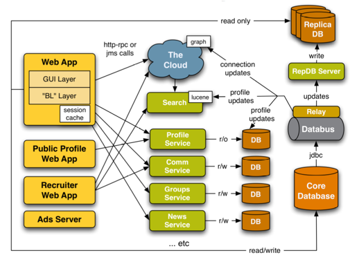
For example, if I take the chart in your edit:

enter image description here

I notice the very first error: shadows. Shadows must be used with caution. In a website, such usage would be unacceptable. A good example of how shadows must be used is Apple.com. Each element the user can interact with has a small shadow, giving a feeling of a volume. No other element has a shadow. In a case of a chart, this may be more acceptable, since users are not intended to interact with the chart. Still, shadows are too large and too separated from the elements. Also, here, there is no need for them: each element has already a border.

Rule of thumb: KISS (or, if you want, "be lazy"). Don't add a border and a shadow and a background color at the same time. Don't make the text bold italic Arial Black 200 red underlined with a yellow border on lime background blinking. Do only what you need to do to add visual impact, nothing more.

Think about styling your charts: nobody wants to see those ugly black and white UML diagrams. But don't overstyle: it will only become worse: UML black and white diagrams are ugly but usable. A rainbow multi-font blinking GIF-animated crap with plenty of icons and arrows that change color is not only ugly, but also unusable.

For the charts, remember the specificity of the context. If it will be shown through a projector, you can't have a green text on a white background: it will just magically disappear when projected on a wall. If it supports your talk, don't put too much on a slide: too much graphics, too much numbers, too much text. The illustration above is a good example of what you must never do for a presentation: with such slide, you're sure that half of the audience goes to sleep, and the other half stops listening to you, trying desperately to understand what's this thing.

Finally, remember that you're here for your audience, not the opposite. If you'll show the chart as the one illustrated above to marketing people, they'll say themselves that you suck. Do they know what is the cloud (or they believe it's something to do with applications which are hosted in the sky/space)? Do they know what represents the brown icon with "DB" on it? Can they explain what is a web app, and how is it different from something-else-app or from a website?

Arseni Mourzenko
  • 134,780
  • 31
  • 343
  • 513
1

It is probably needless to emphasize that the beauty is one of the most subjective opinions ever. As they say, the beauty is in the eye of the beholder, so what is beautiful to you may be ugly as hell to someone else. A lot of better halfs would concur.

That being said, nowadays people probably expect a little more than an ASCII diagram. You don't have to study the theory of colors, but shaping it up a little won't hurt. Sites for making diagrams like, for example, Gliffy have decent looking templates that I bet, would please anyone (or at least, not displease) attending that presentation.

enter image description here

Rook
  • 19,861
  • 9
  • 53
  • 96
1

Once you've done your diagrams using whatever development tools you normally use, re-do them from scratch in Powerpoint or whatever presentation software your company uses. My presentations using the default icons and arrow styles have gotten much better response than those I've done in Enterprise Architect or Power Designer. Skip UML and just go for simple relationship diagrams and flow charts. As with any presentation, throw something together quickly and run it past your manager for feedback. You don't want to be wasting hours laying out an elaborate workflow diagram that your manager will knock down for being "too busy". I'd recommend doing one simple diagram completely, so you can show the style (font, color palette, layout), and mocking up the rest of it for content. Then take it to your manager and get some further direction.

TMN
  • 11,313
  • 1
  • 21
  • 31
0

Be consistent in the font. Space things equally apart and keep them in alignment. Probably add a color or two (company colors?) beyond black and white. Headers in bold. Borders should be distinct. Something a little more than gridlines as the background or none at all.

You may have to break up into separate pages/slides. Nobody wants to see 57 blocks in some chaotic bird's nest diagram (by their perception).

You may want to consult someone in your company with a little more asthetic sense. Run it by someone in sales or marketing.

JeffO
  • 36,816
  • 2
  • 57
  • 124
0

Use rounded corners and muted colors. Use thick lines. Elliance has some good examples. I'm not allowed to post images, though, but here is an example I've used as inspiration for my own diagrams.

undetected
  • 109
  • 1