I am trying to show a visual representation of a few cycles of a 50Hz and 60Hz sine wave at 400 Volts overlapping and trying to find out how to create this as a chart in Excel. Does anyone know how to do that?
Asked
Active
Viewed 7.1k times
2 Answers
10
This is pretty easy to do:
You need a monotonic time-base. With
sin(), you get one complete sine cycle every \$2\pi\$ input values. In this case, I generated a increasing value with a maximum of ~15 (or a bit more then 2 cycles).
Then, you apply the
sin()function to the values from the first column, in a second column.
You now have a sine-wave dataset! Plot it:
Volia: A sine wave!
For different frequencies, you can incorporate a scaling value into the time-value before it is fed into the sin() function. This will let you arbitrarily scale the time-units between multiple columns, if needed.
- Note that this sine-wave has a peak-peak value of 2 units, and the timebase is arbitrary. I leave scaling the wave up to you (just apply an offset and scaling value to the sinewave column).
- I'm assuming familliarity with excel. If you don't know how to plot things in excel, you should ask somewhere like http://superuser.com.
- Technically, I did this with LibreOffice. It's close enough.
Connor Wolf
- 31,938
- 6
- 77
- 137
-
Thanks Connor - I'd actually managed to answer my own question before you posted. (Can you accept two answers?) – TomC Nov 09 '14 at 10:17
-
1Yeah, I saw that. Feel free to accept your own answer. I almost deleted this, once I saw you had yours up while I was still writing. I figured it was mildly useful, so I left it up. – Connor Wolf Nov 09 '14 at 10:21
-
Cool. How do you generate the gradually increasing values for the timebase? – voices Nov 04 '17 at 05:47
-
@tjt263 - A relative formula. Each timebase is equivalent to \$t^{-1} + timestep\$. – Connor Wolf Nov 05 '17 at 01:19
4
I actually worked this out myself (in Excel) and came up with the following which suits what I needed it for:
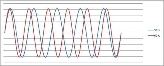
I used the formula: \$v(t)=V_\mathrm{peak}\cdot\sin(\omega t)\$ taken from: http://en.wikipedia.org/wiki/Alternating_current#Mathematics_of_AC_voltages
Then I created the columns in Excel and plotted two series on a scatter graph.
Connor Wolf
- 31,938
- 6
- 77
- 137
TomC
- 224
- 1
- 3
- 9
-
I fixed your TeX markup. EE.StackExchange uses `\$ your TeX here \$` for TeX delimeters. – Connor Wolf Nov 09 '14 at 09:58
-
1So, this shows that you got what you want, but it doesn't really show how you got there. For example, if I want to display a basic 1V AC sine wave with a graphical calculator, I just plot: `sin(x)`, or `y=sin(x)`. 2V amplitude sine wave with a 1V DC offset would be: `2sin(x)+1` (I haven't figured out how to incorporate frequency in Hz yet). But this syntax doesn't seem to be directly compatible with a spreadsheet document. What do you actually type in the cells of your spreadsheet to get that result? – voices Nov 04 '17 at 05:41
-
To plot the graph, I first had to create a table in Excel and then used a combo scatter chart with smoothing to show the curves as I wanted. I can share this with you if you want, but not sure how? – TomC Nov 06 '17 at 08:32