13

enter image description here
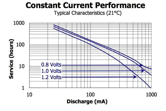
Please ignore the graphed lines, those are irrelevant to the question, it's the graph itself that's relevant.

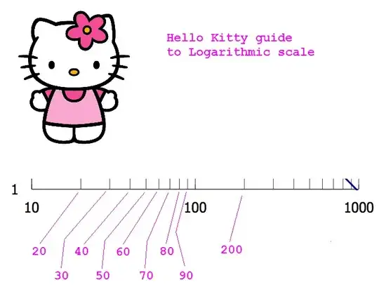
I see this type of graph used all the time, between multiple manufacturers and device types. It's a plotted graph, x * y, where x could be time, and y some value, or vis-versa or a mix of different variables. While I can extrapolate the approximate value of a point between two marked values (ex: The 1 hour and the 10 hour), I still don't know what the in between values should be.

enter image description here

Is each line half between the next highest up? For example. Half way between 100 to 1000 is 500. So that next line up from 100 is 500. Then half way between 500 and 1000 is 750. Then 875, etc? x = y + ((y - z) / 2), where Y is the next marked up, and Z is the last value to the left?

Or is it a simple next value up. 100, 200, 300, etc? If so, why the scaling to the distance instead of linear graph?

And most importantly, do these type of scaled graphs have a specific name or standard attached to them?

Passerby
  • 72,580
  • 7
  • 90
  • 202

4 Answers4

34

Hello Kitty guide to log axis

I'm sorry @Passerby. I couldn't resist.

Nick Alexeev
  • 37,739
  • 17
  • 97
  • 230
11

That's a "log log" graph. You may notice that the major divisions go up by factors of ten.

The minor divisions in the example, say starting after 100, are 200, 300, 400, and so on up to 900.

log(100) is 2

log(1000) is 3

So halfway between is \$10^{2.5}\$ or about 316.

It is said that just about everything is approximately linear if you plot it on a log-log graph with a fat marker.

Spehro Pefhany
  • 376,485
  • 21
  • 320
  • 842
  • Colloquially, some people use expressions "*half an order of magnitude*" and "*order and a half of magnitude*". They mean "*factor of about 3*" and "*factor of about 30*". – Nick Alexeev Mar 26 '14 at 04:53
  • Exactly. It's actually the sameas log(x) plotted on a linear scale, which none of the other answers making that point – Scott Seidman Mar 26 '14 at 10:38
2

It's a log-log plot.

The lines still denote "equal" spacing. So your ? mark is 200, and the ?! mark is 300, and so on.

If there's less than 10 marks, then the step is will be larger (say, 5 minor marks from 100 to 1000 equals 200/minor mark). Because it's a logarithmic plot, their spacing isn't even. It makes is somewhat harder to estimate the value in between the lines, I tend to take a "lazy" approach and linearly interpolate between the minor marks, though you can do a log fit to get more precise results.

Log-log plots are used for several reasons. The figure of interest can have a very large dynamic range (say the irradiance vs. current response of photodiodes), or there may be some interesting exponential growth/decay, which will become linear on a log-log plot.

helloworld922
  • 16,600
  • 10
  • 54
  • 87
2

This is a log graph, or more accurately, log log, because both x and y are log axes. The lines between 100 and 1000 are 200, 300, 400, etc.

Scott Seidman
  • 29,274
  • 4
  • 44
  • 109